

 Reply With Quote
lol, anyway, iy looks great, though the yellow just looks a bit too pale, i think it should be almost white towards the center, leading to a brilliant yellow on the outside edges...but that's just me...
+ Reply to Thread
Results 1 to 40 of 55
Thread: topaz title screen
-
02-24-10 01:10 PM #1
 AdministratorStatus:
 Join Date: Dec 2009Posts: 841
 topaz title screen
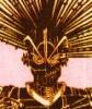
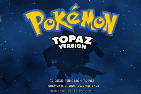
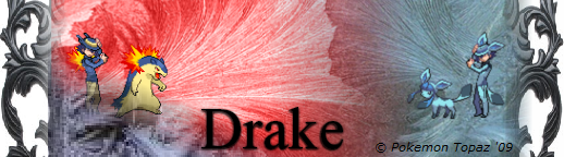
Badara asked me to work on a Topaz title screen. This is the preview, the final version will be animated and hopefully use our own Jirachi concept art.

I think this is the first thing I've ever made for the actual game itself in 5 years - other than site/forum related stuff.Last edited by zeroality; 02-24-10 at 01:21 PM.
-
02-24-10 07:21 PM #2
 RPG AdministratorStatus:
Join Date: Dec 2009Location: .......................Posts: 1,082
RPG AdministratorStatus:
Join Date: Dec 2009Location: .......................Posts: 1,082
-
02-24-10 07:37 PM #3
 Vicious cycleStatus:
Join Date: Feb 2010Posts: 219
Vicious cycleStatus:
Join Date: Feb 2010Posts: 219
It could probably be a bit flashier. Other than that, the silhouette, logo, and background are fine.
-
02-24-10 08:11 PM #4
AdministratorStatus:
Join Date: Dec 2009Posts: 841
It's hard to make a static image 'flashy'. The animation will be better.
 Originally Posted by neon.Barnacle

I agree, I will fix that when I get up. Originally Posted by NyteFyre
-
02-24-10 10:34 PM #5
AdministratorStatus:
Join Date: Dec 2009Posts: 2,942
I imagined something like Piro's Midnight banner back on the old forums. Jirachi flying through a starry sky, with its fabric-tail-things flapping in the wind. If you listen to the Title Screen theme music I think you'll understand why.
-
02-24-10 10:45 PM #6Topaz ProgrammerStatus:
Join Date: Feb 2010Location: EnglandPosts: 23

I think its fine for what we're gonna be using it for now. Like he said, the animations version will be much better

-
02-25-10 05:37 AM #7
AdministratorStatus:
Join Date: Dec 2009Posts: 841
Yeah, that'd be quite a feat. I guess IB doesn't know. >_> Originally Posted by ImmunityBow
-
02-25-10 08:27 AM #8Overworlder (I think)Status:
Join Date: Dec 2009Location: PiePosts: 550
I think it would look better with a darker yellow.
-
02-28-10 10:02 PM #9
Thats what she saidStatus:
Join Date: Dec 2009Location: Utah! Where the population is like rabbits.Posts: 1,335

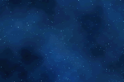
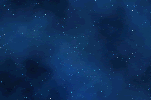
now just wondering...why yellow. Isn't jirach supposed to be in like a starlit night theme. like "night sky's edge" (the pokewalker thingy) it has that sound. It might be just me, but it would look awesome if it had the dark, blue night with twinking stars.Possibly shooting stars (Like in ruby, saphire,firered & leafgreen when the bubbles,flames, or leaves fly around[IMG][/IMG] or whatever on the screen) have twinlkin stars and how on dpp how it has the flame and moving style.... I bet it is just me...and I am sounding very techy (and probably annoying).

This type of theme, with the blueish and all (not the tree)
Like how the flames are rising....u know?

if u do a silhouette, have it noticable at certain times, like how they did in dpp, and how some parts "always" are glowing, it cold be her tags on her head"
I might be able to help, but I dont know.
-
02-28-10 10:12 PM #10
AdministratorStatus:
Join Date: Dec 2009Posts: 841
The Topaz box art was yellow so I used yellow. We'll see what looks good in the animation. Speaking of which, the silhouette will be fancy in the animated version yes. Originally Posted by Quinn
-
03-01-10 04:09 AM #11
shoot head summon personaStatus:
Join Date: Feb 2010Posts: 40
If someone laughs at a joke Zero posts and he can't hear it, is it still funny? Originally Posted by zeroality
Considering our use of a midnight-styled theme for the forums, a starry-night background for Jirachi would not only be easier on the eyes of someone playing (straight yellow's a bit rough), but also fit the sort of mystique Jirachi holds.
-
03-01-10 05:50 AM #12
Vicious cycleStatus:
Join Date: Feb 2010Posts: 219
Now that Piro and Quinn have mentioned it, I also feel that a starry background would work better for the title screen.
-
03-01-10 11:29 AM #13
RPG AdministratorStatus:
Join Date: Dec 2009Location: .......................Posts: 1,082
well, who knows, Zero may get Badara to work it in somehow, : O
-
03-01-10 10:29 PM #14
Thats what she saidStatus:
Join Date: Dec 2009Location: Utah! Where the population is like rabbits.Posts: 1,335
the reason that I have asked is that I just might be able to make one. an animated one at that POSSIBLY. I learned photoshop can make .gif and I could do some animation with twinkles and "shtuff".
If I did do this tough...I would need some help. I could try to "create" a "starry night", but if I Epically fail, then of course I could use some help.Last edited by Quinn; 03-01-10 at 10:42 PM. Reason: for possible help
-
03-01-10 10:42 PM #15
AdministratorStatus:
Join Date: Dec 2009Posts: 841
Sent you a PM with psd. Be my guest.
-
03-01-10 10:57 PM #16
Thats what she saidStatus:
Join Date: Dec 2009Location: Utah! Where the population is like rabbits.Posts: 1,335
k. I'll work with this for a bit, though I will not be absolute sure (yet again I say) I can do this aloneish. I am starting it, and if I need anything or help, I'll give a ring, or if u want a "add-on" now just wondering, how can I turn the midnight theme on?
-
03-01-10 11:26 PM #17
AdministratorStatus:
Join Date: Dec 2009Posts: 841
Dropdown box at the bottom of the forums. Needs to be moved somewhere more visible I guess.
-
03-02-10 02:51 AM #18
AdministratorStatus:
Join Date: Dec 2009Posts: 2,942
The whole "twinkle effect" is a pretty popular one so if you're familiar with image editing software then you might want to check out good-tutorials.com, which has some decent animation tutorials along with Photoshop ones.
-
03-03-10 08:05 PM #19
Thats what she saidStatus:
Join Date: Dec 2009Location: Utah! Where the population is like rabbits.Posts: 1,335
heres what I got so far. Now I didn't see the tutorial yet, and I can't open the psd easily now. but here is the gif. Now I'm not sure if it is just me but the second jirachi glow jumps I think, but might be me. Tell me whatcha think and if I can sexy-ify it up.

-
03-03-10 08:22 PM #20
AdministratorStatus:
Join Date: Dec 2009Posts: 841
Yeah, the gradient jumps as it moves - doesn't look like a smooth transition.
The copyright text needs to be brightened to show up better.
Other than that, it's a great start.
-
03-03-10 08:29 PM #21
Thats what she saidStatus:
Join Date: Dec 2009Location: Utah! Where the population is like rabbits.Posts: 1,335
Now, since I am more new at photoshop (learning from school) how could I brighten those. Also, would u know how to make that transition more like the DPPs? If I got time tonight I am gonna redo the animations. (because the corrupt file. Thank god I have the background still though, that took 2 hrs to make) should I add more twinkles...and should I make it slower?
Also where could I get those fonts? My photshop doesn't have them, and it is hell to try to keep them from changing.Last edited by Quinn; 03-03-10 at 08:42 PM. Reason: need fonts
-
03-03-10 09:23 PM #22
AdministratorStatus:
Join Date: Dec 2009Posts: 841
The font is Battle Beasts.
And the site url at bottom is Visitor (TT2 BRK).
You brighten them by double clicking the layer to select all the text then using the color palette in the font toolbar to select a brighter color.
No, I don't know how to make the transition like D/P. I was going to do it in Flash, which would have yielded far different results than what you are doing.
As for the background/twinkles, I'll let someone else comment as I think it is fine but public opinion may differ.
-
03-03-10 10:29 PM #23
Secret AgentStatus:
Join Date: Jan 2010Location: Neo BayPosts: 1,845
I personally think so, but besides that and the aforementioned "jumping", it looks great! Good job! Originally Posted by Quinn
-
03-03-10 11:32 PM #24
 "We nicknamed her Bean"Status:
Join Date: Dec 2009Location: Ontario, CanadaPosts: 991
"We nicknamed her Bean"Status:
Join Date: Dec 2009Location: Ontario, CanadaPosts: 991
I really think they should be slowed down. It's a little more "realistic" that way.
It looks great though!


-
03-03-10 11:54 PM #25
uh-ohsStatus:
Join Date: Dec 2009Location: 'mericaPosts: 282
Yeah it looks pretty good for a first attempt besides that stuff everyone else said.

-
03-04-10 02:01 AM #26
AdministratorStatus:
Join Date: Dec 2009Posts: 2,942
Yes! That looks great! I have another, improved piece of Jirachi art sketched out, but unfortunately I'm away for the next 10 days. I'll be on break then for the week after that so I'll try to get it done.
-
03-05-10 12:39 AM #27
Thats what she saidStatus:
Join Date: Dec 2009Location: Utah! Where the population is like rabbits.Posts: 1,335
(To IB) I'll take a look at it. I might be able to save ur (if u haven't got it drawn yet)& my time(already got a smother gradiant move) If u want me to use it though still....sure, just might take more time.
(Everyone) I got a possible intro to the title screen. (I think, yet again, it should be slower. I have the non repeating one for zero, I'm sendin ya the "1" go one.)

I will warn all though, if my computer freaks out again (like last night, because the mass amount of changes) I might not be able to....that being said, it is back on track right now (and hopefully forever)
Also tonight I will get the actual screen, into "action". I just gotta redo the star twinkles.Last edited by Quinn; 03-05-10 at 01:18 AM.
-
03-05-10 04:01 AM #28
AdministratorStatus:
Join Date: Dec 2009Posts: 841
You should take a look at the Emerald title screen. It doesn't all 'animate' at once, so maybe try having the starry background appear with twinkles then a fade in with the Pokemon logo. After that, a movement with the Topaz logo to bring it on screen. Finally, bring Jirachi in with whatever effect and do what you want with it. It shouldn't all appear at once is my point.
-
03-05-10 07:53 PM #29MemberStatus:
Join Date: Dec 2009Location: Swartz Creek Mi.Posts: 50
I agree, it looks too plain the way it is.
Wait... Wut?
-
03-05-10 10:50 PM #30
Thats what she saidStatus:
Join Date: Dec 2009Location: Utah! Where the population is like rabbits.Posts: 1,335
I made a new album in my Photobucket for the topaz, so all past links are broken.
I didn't read until now about checking the emerald so I will edit this.
http://i222.photobucket.com/albums/d...tro-Real-1.gif
I was wondering with this...I know we dont need it, but I was wonderin how ya'll think. I am still gonna get those star twinkles, but if u like this too...I can make a couple more.
-
03-06-10 07:01 PM #31
Thats what she saidStatus:
Join Date: Dec 2009Location: Utah! Where the population is like rabbits.Posts: 1,335
Is this Title Intro better?
Also I got VERY LITTLE TIME last night to work with the title. So this is all that I got so far. I know I need to add some more twinkles....because at the end (since this is just to show ya'll "so far") it is black for a bit. Now I like the transparency, but it was actially a mistake, and I dont think I could chang that.
-
03-06-10 10:04 PM #32MemberStatus:
Join Date: Dec 2009Location: Swartz Creek Mi.Posts: 50
I like the transparency! Is the "appearing and re appearing" going to slow down a bit? Isn't it a bit fast? Other than that it looks great!
Wait... Wut?
-
03-06-10 10:09 PM #33
AdministratorStatus:
Join Date: Dec 2009Posts: 841
I don't think I like the slide in effect on both the logo/version title. Can you try something different with the logo?
The moving twinkles are cool but I don't know if they are quite right. Focus on the other stuff first then we'll tackle that.
-
03-07-10 10:25 PM #34
Thats what she saidStatus:
Join Date: Dec 2009Location: Utah! Where the population is like rabbits.Posts: 1,335
I have made a simple video of what I have so far. Now the video is low quality, but yahhttp://s222.photobucket.com/albums/d...rent=Topaz.flv
I have the different images, but I can't upload them all right now
The intro is still the same, but here is the actual title screen
-
03-08-10 12:14 AM #35
Thats what she saidStatus:
Join Date: Dec 2009Location: Utah! Where the population is like rabbits.Posts: 1,335
sorry about posting more than one post...my internet is being stupid and wont let me edit my last one. So...sorry again.
Anyways...
I have changed the intro...the title screen from above is the same but here is the other
(Now for Zero...I dont know much about other effects rather than swipes...but I hope this looks better...I hope it looks more like emeralds. I couldn't just do a flash with the jirachi and the pokemontopaz.net info....it wouldn't look right so I gave em a fade too.)
I hope it is slow enough...otherwise it might start lookin blocky.
Also I updated that video preview, the one of low quality. It just is to show how it will "blend".
-
03-10-10 05:45 PM #36
Resident ComposerStatus:
Join Date: Dec 2009Location: MichiganPosts: 194
Looking pretty good, I'd say. I do think it's still just a tad rushed, I'm not sure how to cure that. If you'd like to work on timings, you can try to implement the Topaz Introduction - Title Screen track from the Soundtrack thread to your work. I figured we should probably address the timing now instead of later. Keep up the good work!
Haven't checked out the Pokemon Topaz Soundtrack? Click HERE!
Like my music and still want to hear more? Check out my compositions at IR's Music Corner!
-
03-10-10 07:04 PM #37
AdministratorStatus:
Join Date: Dec 2009Posts: 841
I don't think you can insert sound into gif? But you could have it playing as you watch the title screen and see if the timing is right.
-
03-10-10 08:34 PM #38
Resident ComposerStatus:
Join Date: Dec 2009Location: MichiganPosts: 194
I see, I thought the video file could be given a soundtrack much like when you create a video file using Power Point. In that case, I could devise a sort time map for the track so that it'd be easier to align visual animations.
Haven't checked out the Pokemon Topaz Soundtrack? Click HERE!
Like my music and still want to hear more? Check out my compositions at IR's Music Corner!
-
03-10-10 10:31 PM #39
AdministratorStatus:
Join Date: Dec 2009Posts: 841
Oh yeah he did make it into a video file but I'm not sure if that'd be the same speed as the gif - which is what we will need. I have to split up the frames individually and send them to Badara.
If you want Irot, that'd probably be helpful. I think Quinn has a good thing going here and once he can finalize it, it should look good. Originally Posted by Irot_Rebod
I actually think I do prefer the transparency fade of the Jirachi over the gradient moving. That one just looks cheap and pre-made.
-
03-10-10 10:51 PM #40
Resident ComposerStatus:
Join Date: Dec 2009Location: MichiganPosts: 194
Well, it seems I was planning ahead when I composed this thing three years ago (Whew... just realized I've been composing for Topaz for three and a half years now.) I made the tempo 120 bpm (two beats per second), which makes it extremely simple to align events to the time.
The only major points to perhaps make note of for animations would be:
0.0" - 2.0"
Introductory timpani roll. Perhaps things could be dimmed down here.
2.0"
Theme begins. I imagine this should be where the "Pokemon" logo and Jirachi appear.
2.5" - 3.0"
String portamento. Using the animation you have for the "Topaz Version" logo dropping out of the Pokemon logo would work nicely.
From there on out, it's really up to you where the rest of the animation occurs. If you give the track a listen, I think you'll see how these events would very nicely line up with the animations provided thus far. (Except for you, zero... you're not allowed to listen. :P)Haven't checked out the Pokemon Topaz Soundtrack? Click HERE!
Like my music and still want to hear more? Check out my compositions at IR's Music Corner!


 Posting Permissions
- You may not post new threads
- You may not post replies
- You may not post attachments
- You may not edit your posts