


 Reply With Quote
Never thought about it. Hmm... we should make one.
+ Reply to Thread
Results 1 to 19 of 19
-
02-21-10 03:26 AM #1
 AdministratorStatus:
 Join Date: Dec 2009Posts: 841
 do the orion defenders have a logo?
Like Teams Rocket, Aqua, Magma and Galaxy do?
-
02-21-10 04:11 AM #2
AdministratorStatus:
Join Date: Dec 2009Posts: 2,942
-
02-21-10 08:48 AM #3
 aut vincere aut moriStatus:
Join Date: Dec 2009Location: EarthPosts: 945
aut vincere aut moriStatus:
Join Date: Dec 2009Location: EarthPosts: 945
Probably just some sort of O with a cool design then.
-
02-21-10 01:12 PM #4
AdministratorStatus:
Join Date: Dec 2009Posts: 2,942
Maybe and O with a sword going through diagonally, to show their "0" dependence on Pokemon aim?
I'll try to illustrate this after I'm done with that Jirachi (which has basic colours and lineart but no shading yet)
-
03-18-10 02:39 AM #5
Back Again!Status:
Join Date: Mar 2010Location: Lake TahoePosts: 99

http://img62.imageshack.us/img62/764/orionlogo.png
Best I could do, maybe add a tail to the star? (don't currently know how, but I could try)
Or I could turn the star into the pommelstone area of a diagonal sword.Last edited by zeroality; 03-18-10 at 02:54 AM. Reason: large image is large
-
03-18-10 02:55 AM #6
AdministratorStatus:
Join Date: Dec 2009Posts: 2,942
I think either it should be 3 stars (for Orion's Belt) or just a diagonal sword. In sprites it'd be really hard to depict stars though.
-
03-18-10 05:01 AM #7
Back Again!Status:
Join Date: Mar 2010Location: Lake TahoePosts: 99

Best I could do again. Also tried to make a smaller version. Once I learn how to make a sword in inkscape, I'll try that too.
I was thinking a "O" that is compressed horizontally (like the "G" in team Galactic) with a sword weaved in it. Pommel and base of sword go over, mid goes under, and tip extends out. pommel @ top right, tip @ bottom left.
-
03-18-10 06:07 AM #8
AdministratorStatus:
Join Date: Dec 2009Posts: 841
Yeah, try that.
-
03-23-10 10:32 PM #9the Dragon MasterStatus:
Join Date: Mar 2010Location: Pokemon GoPosts: 303
I was thinking that it could be O for Orion Defenders and then inside the general layout for the constellation of Orion...
but these look pretty good and from the sound of the last one that may be cooler than what I was thinking of...Xbox: Y2K Virus
PSN: Ryu-Tenno
DeviantArt: LordStephen
-
12-28-10 05:05 AM #10
Spriter and Gym designerStatus:
Join Date: Nov 2010Location: Over therePosts: 764
I actually think it should be a very simplistic logo. Note how they are rivals of Team Rocket, who have a very simplistic logo, simply a red "R". Orion Defender's logo should be an italicized, shiny, golden "O".
This was OddCrow's idea:Which I actually think is a good idea, but if we do this, than the Rocket logo should be changed, probably to something with some kind of Team Rocket equivalent of the sword in the Orion Defender's "O", and possibly a colour change (I suggest Gengar's shade of purple, if any colour change at all).I was thinking a "O" that is compressed horizontally (like the "G" in team Galactic) with a sword weaved in it. Pommel and base of sword go over, mid goes under, and tip extends out. pommel @ top right, tip @ bottom left
Just suggestions, but I'd be happy to make them. I can't think of anything for a Rocket equivalent of the sword, so if anyone can suggest something, I'll make the Rocket "R". I'm not saying I expect these changes to be in the game, but I'm bored, so I'll go ahead and make both Orion "O"s right now. It might be a waste of time, but again, I'm bored.
-
12-28-10 02:39 PM #11
Spriter and Gym designerStatus:
Join Date: Nov 2010Location: Over therePosts: 764
Actually, I think the sword would work better if it goes the other way, pommel and base at bottom left, and tip at the top right.
-
12-29-10 06:29 PM #12
AdministratorStatus:
Join Date: Dec 2009Posts: 2,942
I like the Rocket R already. It's resonant, simple, easy enough to sprite and recognizable.
I don't think anyone's really suggesting anything too complex for Orion. A constellation figure is just three stars, like Orion's Belt. A sword can be simple enough since the only ornate swords are the useless ones anyway.
-
12-30-10 12:20 AM #13
Thats what she saidStatus:
Join Date: Dec 2009Location: Utah! Where the population is like rabbits.Posts: 1,335

God save you all from this...
wait for it...
THERE!!!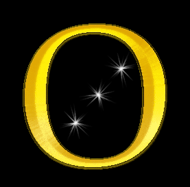
I'm not too pleased at it though, totally serious. I still have the PSD for use...but yeah.
Hi people. This vacation gave me some time. Peaking around, I might have a go at a nice load of stuff during my stay again.DO U LIKE WATER????? then u like 75% of me.
Water type is the god of all. Johto will always be the best region ever (though topaz's Caldera & Kirant will be 2nd)
-
12-30-10 12:48 AM #14Senior MemberStatus:
Join Date: Apr 2010Location: Route 120Posts: 357
oh mah gawd!
what the hell?
i personally love that oneTRPG profile
3DS Friend code: 3711-7748-4916
I has X, Looking for Y stones, will trade for good stuff.
-
12-30-10 12:53 AM #15
Thats what she saidStatus:
Join Date: Dec 2009Location: Utah! Where the population is like rabbits.Posts: 1,335
remember though it wouldn't really have a background, and when sprited, the white would be just dots if not even there or 1 dot even. Though you see the Big Rocket R many times on other stuff than sprites too. Its just some eye candy.
DO U LIKE WATER????? then u like 75% of me.
Water type is the god of all. Johto will always be the best region ever (though topaz's Caldera & Kirant will be 2nd)
-
12-30-10 01:08 AM #16
Spriter and Gym designerStatus:
Join Date: Nov 2010Location: Over therePosts: 764
I really think that the Orion logo should look similar to the Rocket logo. I imagine Orion and Rocket to be equal, therefore shouldn't have logos that are too different. I strongly think there shouldn't be stars or a sword or anything in the Orion logo if there's no opposite of the sword or stars in the Rocket logo. Just my thoughts.
-
12-30-10 12:42 PM #17
Better Than That GuyStatus:
Join Date: Dec 2009Posts: 733
Uh no. They are opposite so it would make sense for one to be complex and fanciful and the other plain and simple, it's called contrast. Although I wouldn't mind just a simple golden O.
-
12-30-10 03:29 PM #18
 "We nicknamed her Bean"Status:
Join Date: Dec 2009Location: Ontario, CanadaPosts: 991
This. It isn't like the logo is going to be showing up all that much anyway, so as long as it's recognizable in context, it dosen't really matter how complex it is.
"We nicknamed her Bean"Status:
Join Date: Dec 2009Location: Ontario, CanadaPosts: 991
This. It isn't like the logo is going to be showing up all that much anyway, so as long as it's recognizable in context, it dosen't really matter how complex it is. Originally Posted by Black Temple Gaurdian 750


-
01-01-11 01:36 PM #19
Secret AgentStatus:
Join Date: Jan 2010Location: Neo BayPosts: 1,845
Yes.
Also, I had a great view of Orion on my drive home last night. I wish we could encorporate that, but it wouldn't really show up on sprites.


 Posting Permissions
- You may not post new threads
- You may not post replies
- You may not post attachments
- You may not edit your posts