


Cool, actually. Duval's got the right expression and it looks neat (the lack of anti-aliasing slightly hurts the eyes, but at least yours is easy to transparentize). Good job!
Results 1 to 21 of 21
Thread: OddCrow's Concept Art
-
04-22-10 03:00 AM #1
 Back Again!Status:
 Join Date: Mar 2010Location: Lake TahoePosts: 99
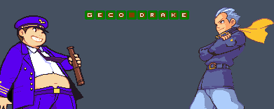
 OddCrow's Concept Art
I hope you guys enjoy, this is the first time I've ever done this, so go easy.

DUVAL

APPROX. COMPLETION TIME: 1 HR
-
04-22-10 03:32 AM #2
 AdministratorStatus:
Join Date: Dec 2009Posts: 2,942
AdministratorStatus:
Join Date: Dec 2009Posts: 2,942
-
04-22-10 04:06 AM #3
Back Again!Status:
Join Date: Mar 2010Location: Lake TahoePosts: 99
:0 I just noticed that Duval's Spikes are red and his head is bean-shaped not oval. I'll fix them when I can.
I think my next project will be Jackalant or maybe Kondria.
-
04-24-10 10:53 AM #4
AdministratorStatus:
Join Date: Dec 2009Posts: 841
Yeah, you should try to get your anti-aliasing technique down.
-
04-24-10 04:37 PM #5
AdministratorStatus:
Join Date: Dec 2009Posts: 2,942
It's not really so much a technique as simple outlining with an anti-aliased brush or having a really thick outline and deleting the external portion using the magic wand tool with "anti-alias" set on.
-
04-24-10 11:01 PM #6
Back Again!Status:
Join Date: Mar 2010Location: Lake TahoePosts: 99
I did this with microsoft paint just so you guys know. :/

Last edited by OddCrow; 04-24-10 at 11:51 PM.
-
04-25-10 09:21 AM #7
AdministratorStatus:
Join Date: Dec 2009Posts: 841
GIMP is a free alternative to photoshop.
-
04-25-10 03:08 PM #8
AdministratorStatus:
Join Date: Dec 2009Posts: 2,942
Paint.net also works, though not as well.
Note that it IS possible to anti-alias on MSPaint. You just have to select a lighter colour and make dots on the outline as you would when spriting, but on a larger scale. It's kind of tedious though.
-
04-26-10 04:16 AM #9
AdministratorStatus:
Join Date: Dec 2009Posts: 841
The antialiasing really needs to be fixed before it goes up on the concept art page.
-
04-30-10 06:40 AM #10
Back Again!Status:
Join Date: Mar 2010Location: Lake TahoePosts: 99
Finalized version.
Hope you guys enjoy it!

Last edited by OddCrow; 04-30-10 at 07:10 AM.
BLAST FROM THE PAST
-
04-30-10 04:05 PM #11
Vicious cycleStatus:
Join Date: Feb 2010Posts: 219
Anti-aliasing is a lot better now. However, I keep on thinking that it's vector art when it clearly isn't. Of course I'm not suggesting that you learn how to vector (though it's a nice skill to have), just that your art would look much nicer with it.
Also, word of advice: never label artwork as "finalized", because it can always be better. Otherwise you're only limiting yourself in your mind.
-
04-30-10 09:32 PM #12
AdministratorStatus:
Join Date: Dec 2009Posts: 2,942
MUCH smoother on the eyes, that's a lot better OddCrow. The horn ends a bit abruptly though (there's no shadow or slot for it go into) and the arm should be making a shadow, but it's a pretty nice concept.
-
05-09-10 12:53 AM #13
Back Again!Status:
Join Date: Mar 2010Location: Lake TahoePosts: 99
So if I fix the shading a bit, and add a horn/head bridge, then it's good enough to go up on the concept art page? Or does it need several other things done too.
BLAST FROM THE PAST
-
05-09-10 02:47 AM #14
AdministratorStatus:
Join Date: Dec 2009Posts: 2,942
I think it's almost there. It looks pretty well done already. Preferably it would be transparentized, but that's not 100% an issue.
-
05-09-10 07:21 AM #15
Back Again!Status:
Join Date: Mar 2010Location: Lake TahoePosts: 99
Well, here's the thing about making it transparent.
If I make any changes, they will be to the non-vectored image, then it will be smoothed out using InkScape, I am unsure of how to make something transparent in inkscape, but if I find it out I will.
BLAST FROM THE PAST
-
05-09-10 04:01 PM #16
AdministratorStatus:
Join Date: Dec 2009Posts: 841
If you can't then I can probably do it.
What you said that needs fixing would get it up on the page, yes. I can't notice anything else that needs to be done.
-
05-31-10 01:07 AM #17
AdministratorStatus:
Join Date: Dec 2009Posts: 841
Any update to this?
About to add Havoc's new art, as well as a few others and was reminded of this.
-
05-31-10 06:37 PM #18
Back Again!Status:
Join Date: Mar 2010Location: Lake TahoePosts: 99
I'd say this is complete, I can't make any changes, because everytime I try to, it adds a thin red line outline on all the interior shading curves, which looks really bad, and I simply can't figure it out :/
BLAST FROM THE PAST
-
06-01-10 12:18 AM #19
AdministratorStatus:
Join Date: Dec 2009Posts: 2,942
Yeah, I think it's already good enough if OddCrow can't improve it anymore. Seems like it's concept art page quality, don't you think?
-
06-01-10 04:06 AM #20
AdministratorStatus:
Join Date: Dec 2009Posts: 841
I'll add it on the next update.
-
07-01-10 05:33 AM #21Junior MemberStatus:
Join Date: May 2010Location: MarsPosts: 21
I still thnk its good


 Posting Permissions
- You may not post new threads
- You may not post replies
- You may not post attachments
- You may not edit your posts